TARA MIND
Patient Onboarding
Role: UX Designer
Team: Head of Product • CTO • Clinical Team
Overview
TARA Mind is a mental health startup that offers affordable access to Ketamine-Assisted Therapy (KAT) for individuals suffering from Treatment-Resistant Depression through an employer-sponsored benefit. Our team developed the MVP of a coordinated care platform, Synapse, to enable therapists and prescribers to deliver KAT.
Problem
We needed a way to verify potential patients’ eligibility for the TARA Mind Ketamine-Assisted Therapy benefit. This included employer eligibility, intake information, and mental health survey results to determine qualification.
Business Goal
Deliver an MVP of the patient onboarding flow to present at our quarterly board meeting and enable future patients to access the TARA Mind benefit.
PHASE I: DISCOVER
Maximizing Limited Research
Due to our tight deadline, we couldn't conduct in-depth user research. Since the business prioritized attracting employers and practitioners to drive revenue, patients were not our primary focus. To bridge this gap, I leveraged AI to create a lightweight patient persona, helping the team empathize with our user’s needs, goals, and pain points.
Auditing the Landscape
I audited competitor patient onboarding experiences including AbleTo and One Medical to uncover best practices and visual inspiration. I focused on the mobile experience since our patient onboarding and portal were mobile.
Competitor Insights
Mobile-Friendliness
AbleTo designed their questionnaire with one question per screen, helping users stay focused without scrolling.
Managed Expectations
AbleTo’s onboarding flow used friendly, concise language to outline onboarding steps, helping users understand what to expect before starting.
Visual Pauses
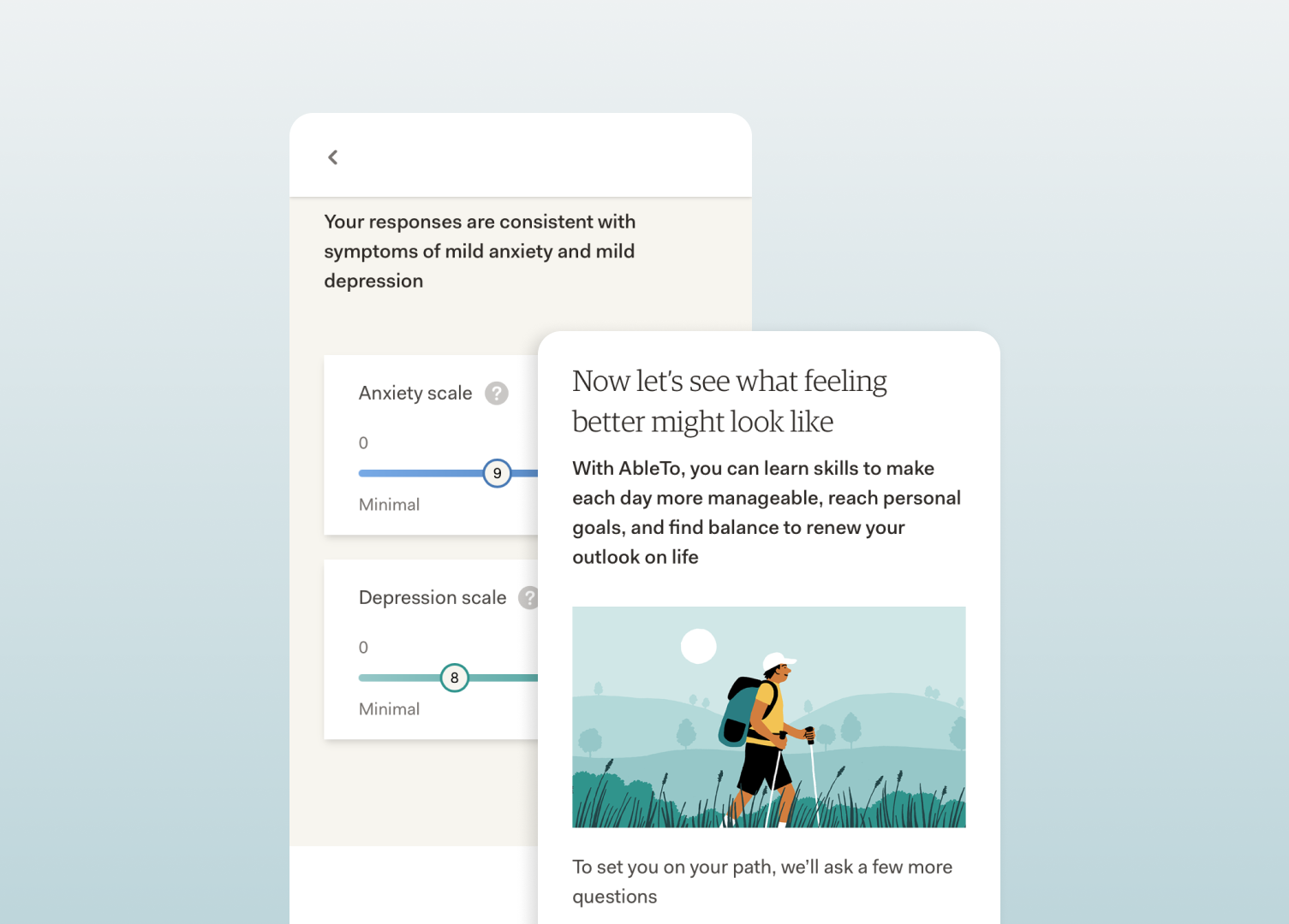
AbleTo used survey result visualizations and inspirational content as dividers to give users mental breaks between sections.
Analyzing Mental Health Questionnaires
As part of my research, it was important to understand the patient experience and the nature of the health questionnaire. I reviewed assessments covering a range of mental health conditions, including anxiety, depression, early childhood trauma, eating disorders, and obsessive-compulsive disorder.
PHASE II: DEFINE
Mapping the Onboarding Journey
I then defined the user flow, detailing each step a patient would take to complete onboarding and qualify for the TARA Mind benefit.
PHASE III: DESIGN
Sketching Flows
I sketched out wireflows, defining key screens I needed to design for our Engineering team. This helped map out the user journey visually before moving into high-fidelity designs.
Remainder of case study coming soon


